Art Museum Ticketing Platform Redesign
WEB APP CASE STUDY
UX Design
UI Design
User Research
Secondary Research
Information Architecture
Content Writing
Challenge
Users have difficulty finding their way around the Dallas Museum of Art (DMA) ticketing platform. Usability testing revealed 66% of users get stuck in the ticket selection process and were unsuccessful at their first attempt to check out.
Goal
Make it easier and faster to book tickets, so guests can plan their visit and save time at the museum. Increase checkout completion rate to boost ticket sales.
Audience
Previous and prospective museum visitors from the Dallas-Fort Worth area and around the world.
Museum visitors view special exhibition The Impressionist Revolution from Monet to Matisse. Image from DMA.
In fiscal year 2024, the museum had nearly 320,000 visitors from 150 countries and all 50 U.S. states.
Source: Dallas Museum of Art 2023–2024 Annual Report
I discovered this opportunity when purchasing special exhibition tickets for a friend’s visit. I’ve had a very positive experience visiting the museum, so I was surprised when the ticketing site didn’t live up to the same quality.
In addition to improving the user experience, I saw potential for the museum to benefit from a redesign through:
Higher ticket sales by simplifying the process and providing more payment options.
More repeat customers by allowing users to save their info, checkout faster in the future, and keep track of tickets digitally.
Marketing opportunities by collecting contact info for users who opt-in to receiving museum messaging.
Membership and donations increase by positively emphasizing these options in the redesign and leveraging the increase in user contact info.
Questioning and Testing Assumptions
To identify users’ biggest pain points, I conducted usability testing. I got better acquainted with the DMA’s site, its ticketed events, its audiences, and its brand. I also researched other ticketing platforms, checkout flows, and museums with comparable ticketing and pricing models as a foundation for my work.
User Pain Points
Confusing navigation and language used
Unclear pricing and ticket info
Updating or changing orders feels complicated
Separation of general admission and exhibition tickets as "add-ons" is not intuitive
Repetitive and unclear checkout process
PROTO PERSONA
Emily
Age: 33
Gender: Female
Occupation: Brand Manager
Location: Little Elm, TX
Family Status: Married with a child
Education: Bachelor’s degree
Behaviors
Enjoys exploring art and music scene around Dallas-Fort Worth area.
Often meets friends and family on the weekends for cultural events.
Likes to plan travel and activities ahead of time.
Regularly uses her phone to make purchases and find info.
Pain Points
Limited free time due to work schedule and parenting a toddler.
Complicated, slow booking systems that don’t work well on mobile.
Long lines and large crowds that make it challenging to enjoy outings.
Goals
To book advance tickets so she can maximize her museum time.
To stay informed on upcoming exhibitions and events at DMA.
To have her ticket purchase be convenient using her mobile phone.
To have quick, easy entry to the museum and its ticketed events.
The proto persona is based on museum visitor demographics research, usability test insights, and ChatGPT and Perplexity.ai assistance.
User Story 1
As a first-time visitor, I want to easily book tickets in advance so I don’t have to wait in line at the museum.
User Story 2
As returning visitor, I want to save my info so I don’t have to enter it every time I book tickets.
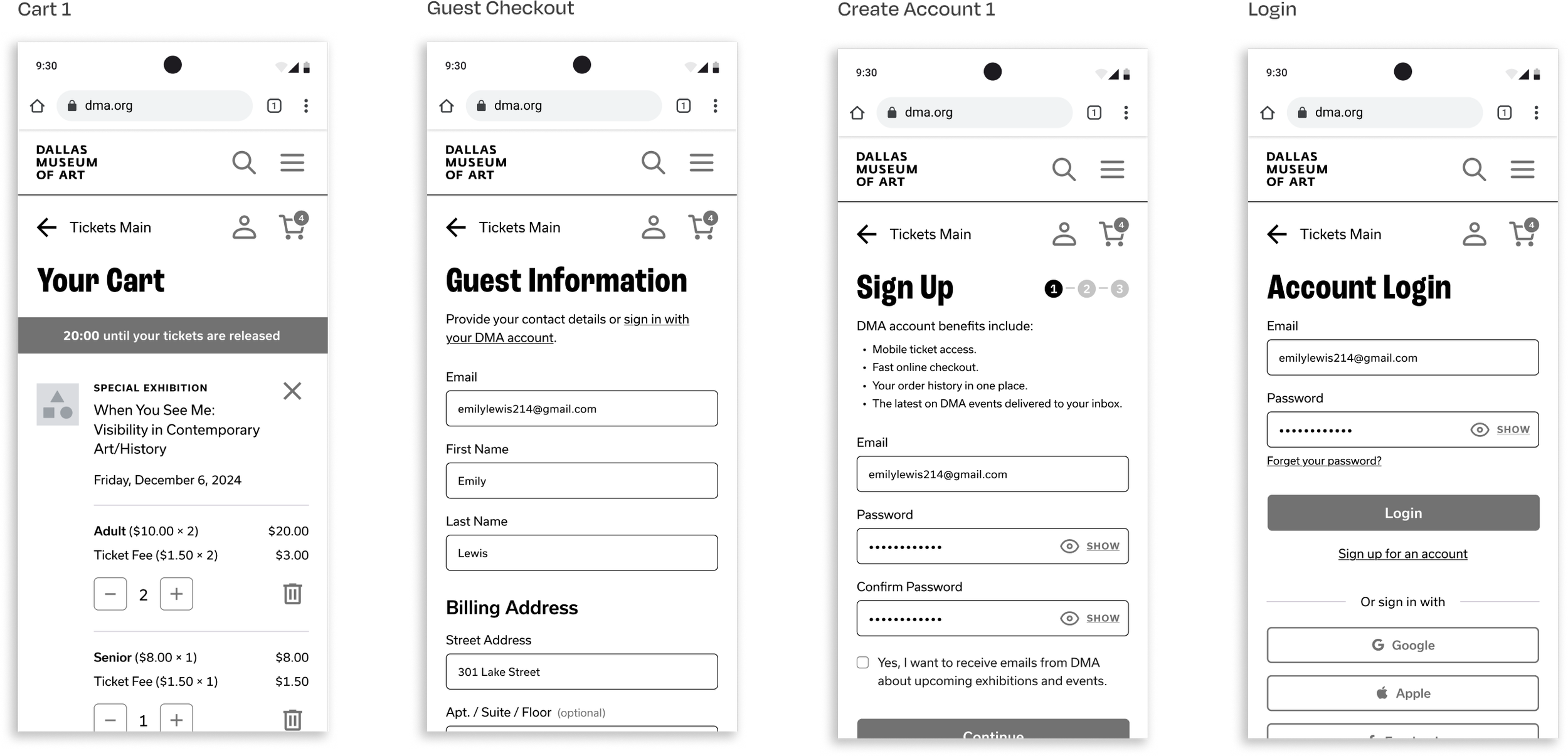
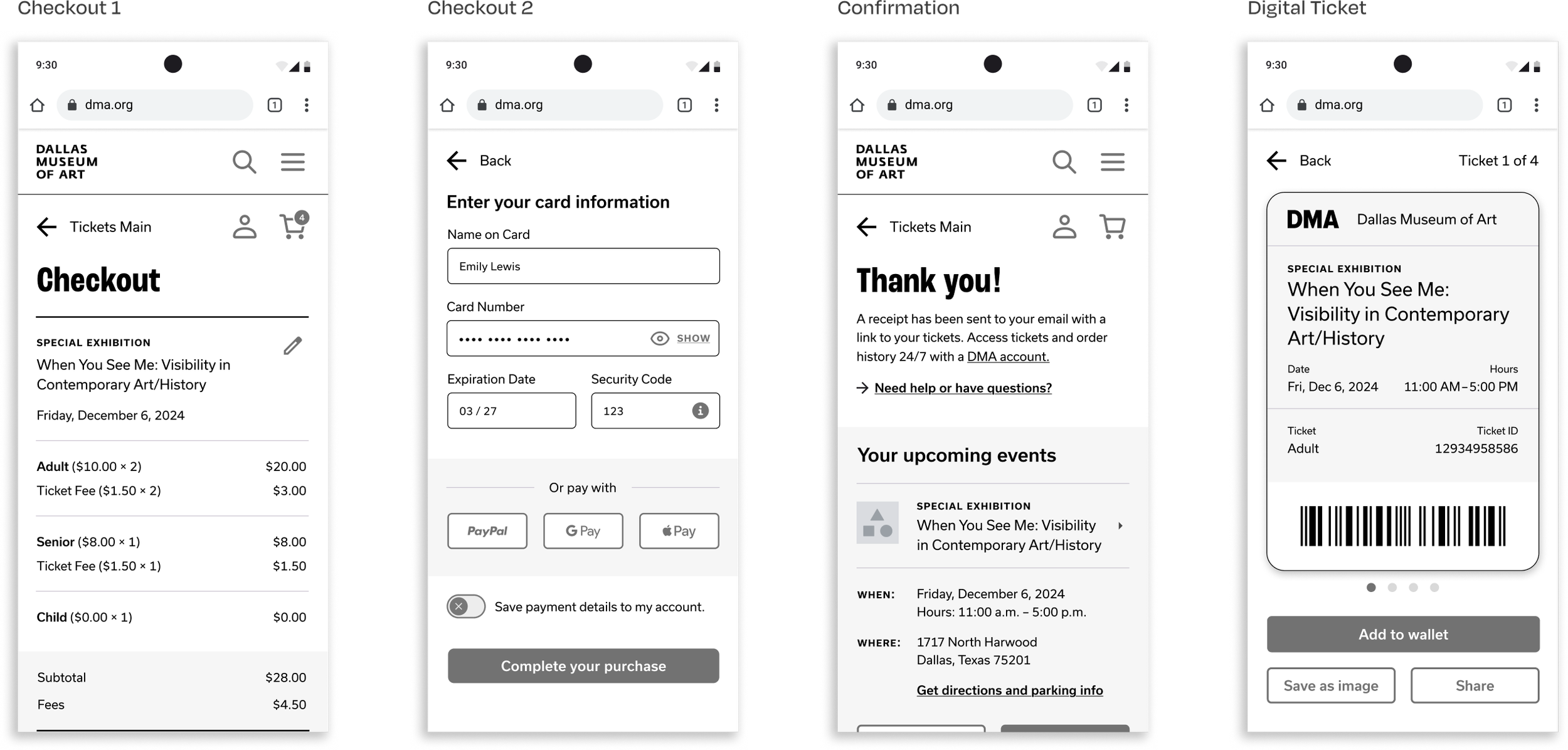
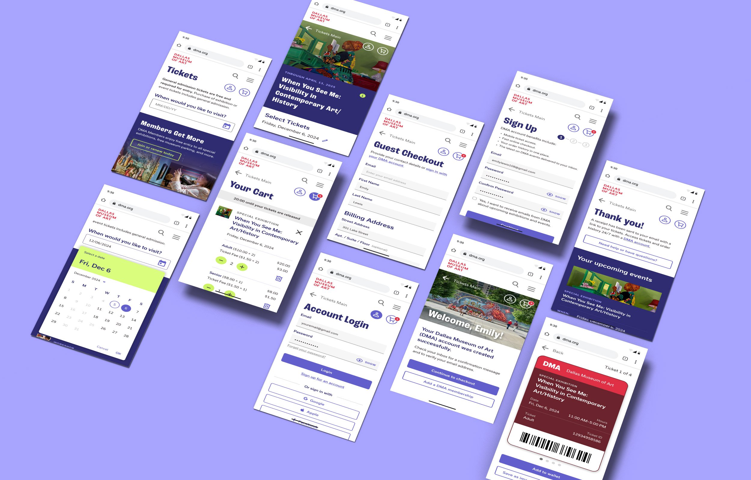
Unlike the current system, this flow gives users the option to check out as a guest, create a new user account, or log in with their existing account to save time.
Reducing Confusion Around the Entry Ticket Requirement
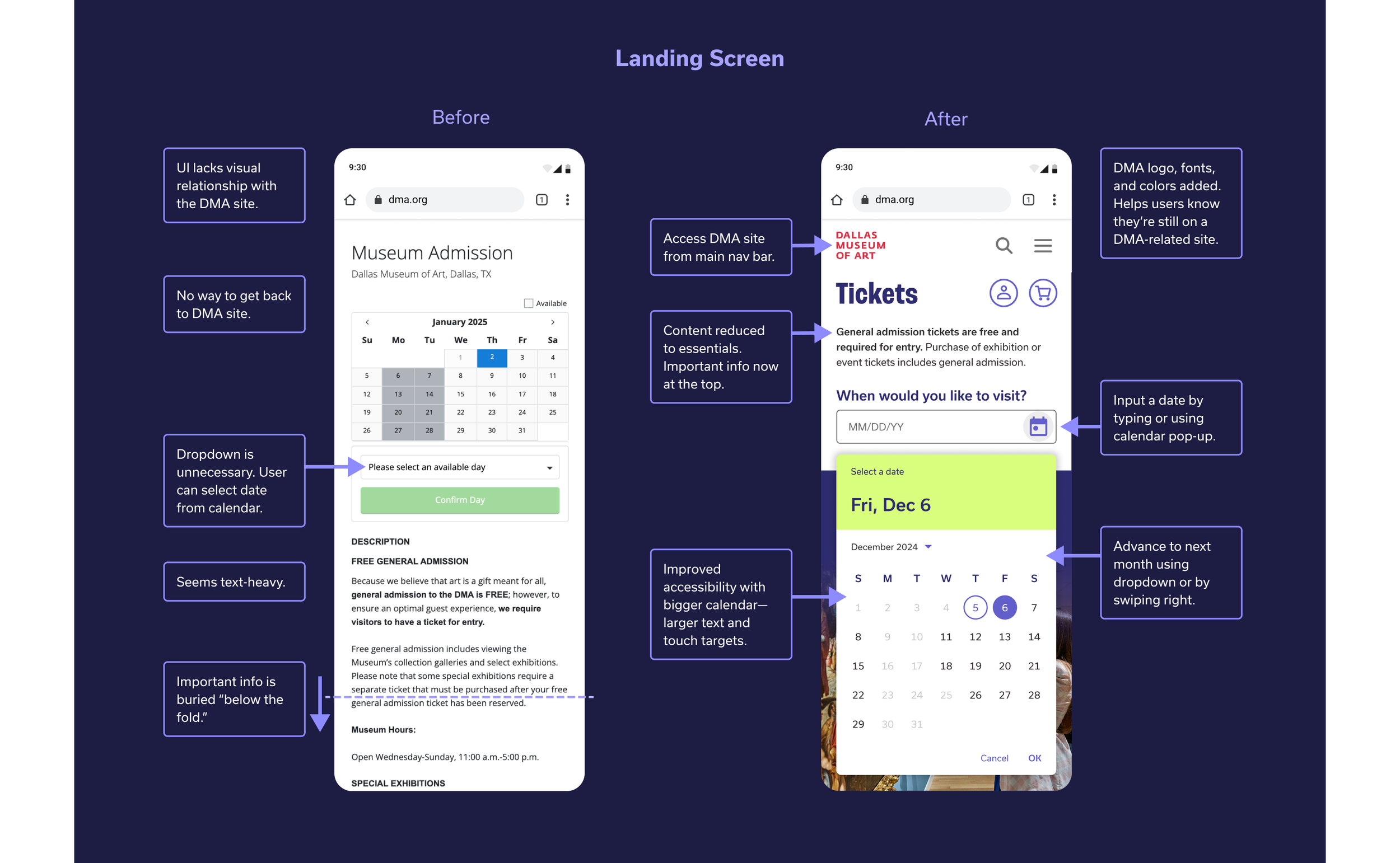
The museum is free but requires an entry ticket. Users have to reserve entry tickets in the platform before they can see any event tickets available for purchase. This set of steps is unclear in the current platform.
In the new design, museum entry is automatically included with the purchase of an event ticket. From the home screen, a user selects their visit date and a list appears of all event tickets available on that date.
Mid-Fidelity Wireframes
Creating a Through Line with the DMA Brand
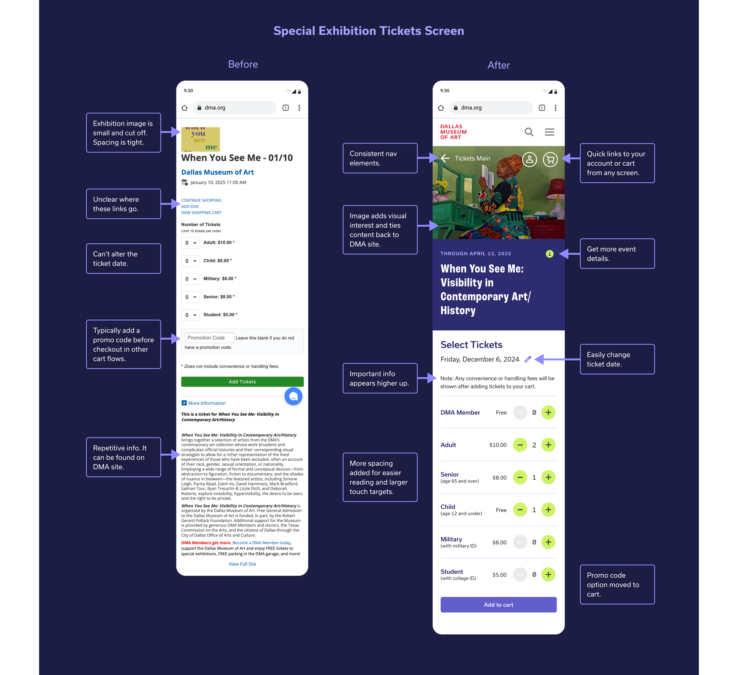
The existing ticketing platform shares little to no visual relationship with the DMA site. By adopting the DMA brand into the new design, users can be more confident they’re in the right place when purchasing tickets.
Integrating color, imagery, and type from the museum brand also lends some personality and aesthetic appeal to users’ experience.
Created with assets found on DMA’s site and social media accounts, the board is my interpretation of the museum’s brand mood.
Improving Wayfinding, Simplifying Content, and Saving Time
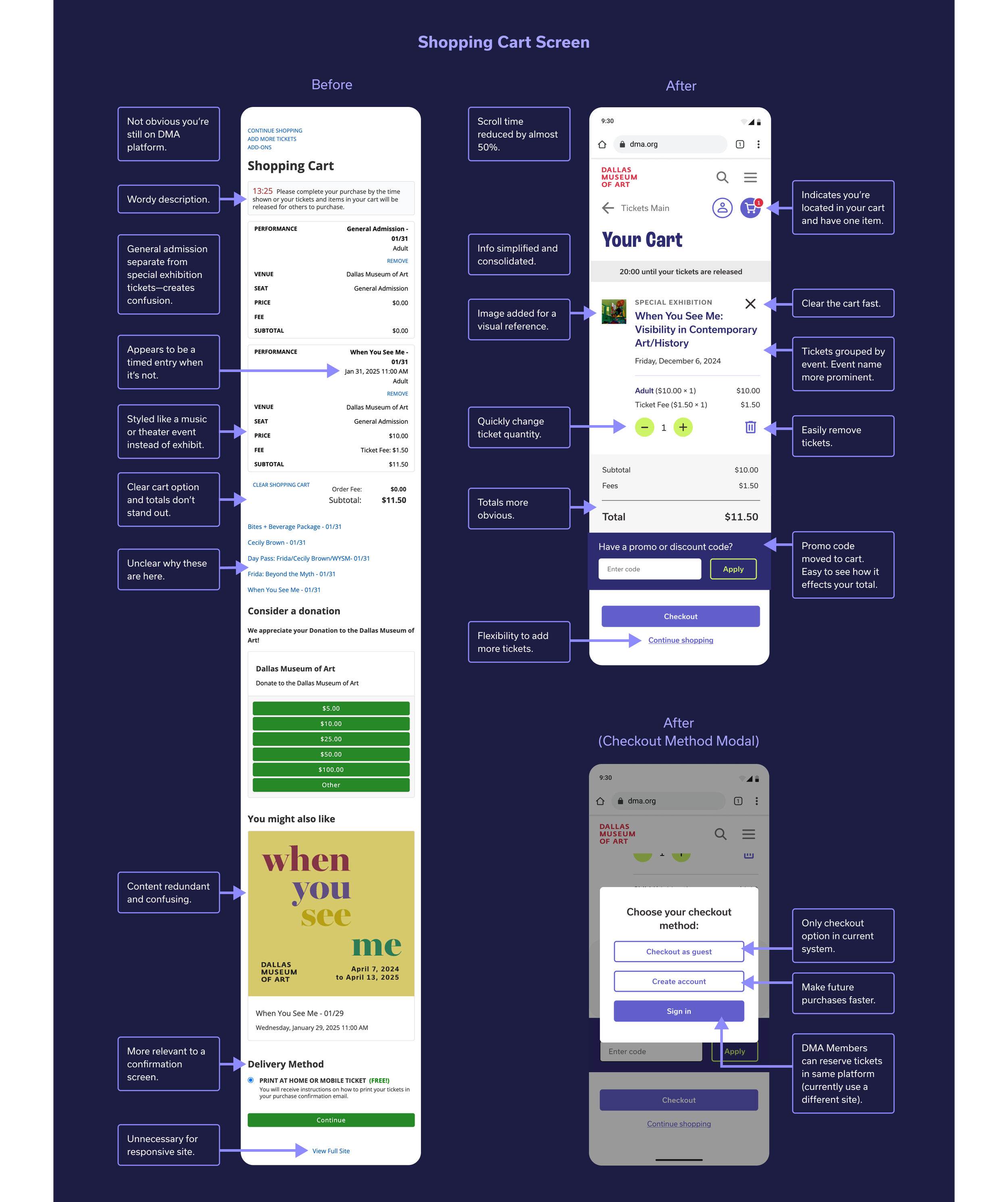
At every stage, I looked for ways to streamline content so users could avoid information overload and wasted time. I added a navigation bar and identifiable buttons to simplify wayfinding. Spacing, typography, color, and image were used improve the organization of information and make the mobile experience friendlier and more usable for audiences.
Meeting Users Where They’re at with Responsive Design
Because the platform is a web app and the museum serves a wide audience that varies in age, ability, and access, it should work well on any device. I prioritized the mobile experience as it offered the biggest potential for increased convenience and flexibility for users. Design work has begun for desktop and tablet and will continue in the next project iteration.
Tickets home screen redesign
Shopping cart screen redesign
Final Outcomes
Many updates were made to increase speed, ease, and convenience for ticketing platform users. Results included a reduction in content, more error recovery, clearer navigation, adoption of the DMA’s visual brand, and an optimization of the mobile experience.
Lessons Learned
Leveraging AI during discovery saved me time with secondary research and usability test result summaries.
Creating a proto persona helped me focus on one user type for this iteration. The museum serves a diverse audience, so the platform has the potential for many user types.
It’s crucial to view designs at scale regularly. The desktop and tablet layouts had to be sized down to look more natural.
Next Steps for the Project
Usability test the redesign.
Improve platform’s discoverability from DMA site.
Design flows for other user types and ticket categories.
Build out additional details and interactions in prototype.


