PlutoPay
Finance App
WEB APP CASE STUDY
UX Design
UI Design
Visual Design
User Research
Secondary Research
Information Architecture
Content Writing
Challenge
Making purchases online and sending money can be inefficient, frustrating, and even risky. In addition, users often find that access to their money and financial info is spread across multiple providers and accounts. This can make managing their money difficult.
Goal
Design a simple, secure app that merges traditional banking with the convenience of a digital wallet. Provide users with easy methods for adding money to their account, making payments, sending money, and seeing all their financial info in one place. Boost user confidence in their money management abilities.
Audience
Individuals ages 35 to 55 in the U.S. who want convenient, secure online transactions and a one-stop-shop for managing their money.
Understanding the Financial Product Space
To improve my knowledge of financial tech and digital transactions, I researched the evolution of digital payments and popular money apps. I learned where it all started (EFTs) and where it’s going (digital wallets and super apps). My competitive analysis focused on two apps—PayPal and Revolut.
Potential Competitive Advantages
Make the product a full-featured, browser-based web app that works on any device. PayPal and Revolut’s web apps are clearly lower priority than the native apps and they sometimes lack major features. A web app can expand customer access.
Keep the PlutoPay audience narrow to better customize the experience for a target group. Trying to be everything to everyone is a disadvantage for PayPal and Revolut.
Prioritize customer support and transaction transparency. Revolut users are unhappy with limited customer support and long response times. PayPal customers are sometimes confused about fees and slow transfer speeds.
Ensure features and services are easily discoverable. It takes time and effort to understand the full range of Revolut’s offerings.
Identifying Our PlutoPay User
I conducted user interviews to gain insight into attitudes and experiences with online transactions and managing money. Based on this research, I determined the first release of PlutoPay should focus on saving, budgeting, and money insight features.
Interview Participants
Number of Participants: 5
Age Range: 35–48
Location: U.S. and Germany
Gender: 4 female, 1 male
Occupations: freelance writer, student, small business owner, office worker, caretaker
Notes from each interview were organized into findings categories (see Color Key). Findings were then sorted with affinity mapping to identify common themes.
Key Takeaways from User Interviews
Security and privacy are very important.
Financial priorities are on budgeting and saving.
Online shopping is primarily for necessities and not usually a leisure activity.
Would like learning opportunities and insights into their money to build financial confidence.
Want to feel a sense of financial control even when money and life are in flux.
Sometimes slow to adopt new tech. Unsure of its safety, trustworthiness, and advantages.
Want less friction and stress when making purchases and accessing money while traveling internationally.
Would like purchases and transfers to be streamlined, transparent, and flexible.
Joanna combines several characteristics from the user interview participants. She wants to save money, gain financial confidence, has security and privacy concerns, and needs transactions to be quick and easy.
Some aspects of the personas came from product gaps I discovered in my research. Very few apps allow sellers to accept card payments directly from a mobile phone. A separate point-of-sale (POS) device is often required.
One interviewee expressed frustration with fees and barriers to entry when managing her business finances. There appears to be a gap in products for easily managing personal and self-employment finances in the same platform.
Both personas face similar challenges—job changes, managing household finances, and balancing multiple responsibilities. Anthony needs to budget for his family while managing money for his small business.
Getting Joanna and Anthony to Their Goals
To help Joanna and Anthony reach their goals with the app, I wrote three objectives from their perspective, broke each down into steps for a task flow, then mapped out each task flow into a user flow. The flows were very helpful for thinking through steps a user might take to complete a task before ever putting pen to paper or pixel to screen for wireframes.
Knowing When to Course Correct
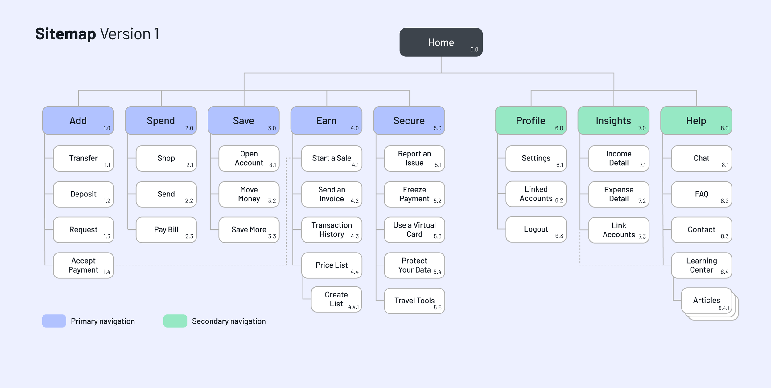
After conducting an open card sort and mentor feedback on my sitemap, I realized I was trying to do too much with the app. I wasn’t focusing on core feature requirements like making payments and sending money.
Sitemap Updates
Eliminated the Earn section to keep the app focus on payments and personal finances.
Changed label wording based on card sort results. Words like Shop (a noun and a verb) confused participants.
Added login and sign up elements to show how a user gets to the app home screen.
Shuffled section order to better align with design brief and user priorities.
Refining the Approach
With each design iteration, I included more app details and worked out additional screens and flows based on feature requirements and user priorities. The wireframes got more refined alongside the prototypes. By the mid-fidelity iteration, I was able to build scrolling, screen transitions, and some animations into the clickable prototype.
Before the high-fidelity wireframes, I crafted a design system draft. I carefully considered spacing, color, icons, typography, and imagery appropriate for the app and its users. I practiced new Figma skills to build components and design patterns included in the system. This approach helped me keep the UI for each screen consistent.
Low-Fidelity Wireframes
Mid-Fidelity Wireframes
High-Fidelity Wireframes
Putting PlutoPay to the Test
I conducted a moderated usability test with six participants on the mobile prototype. Testing was used to determine if users understand what the app is about and how they completed core tasks.
Testing and Review Methods Used
Usability Testing
Preference Test
Accessibility Audit
Peer Review
Testing Outcomes
All six participants were able to complete the tasks.
Participants found the app easy to use and expressed a positive experience overall.
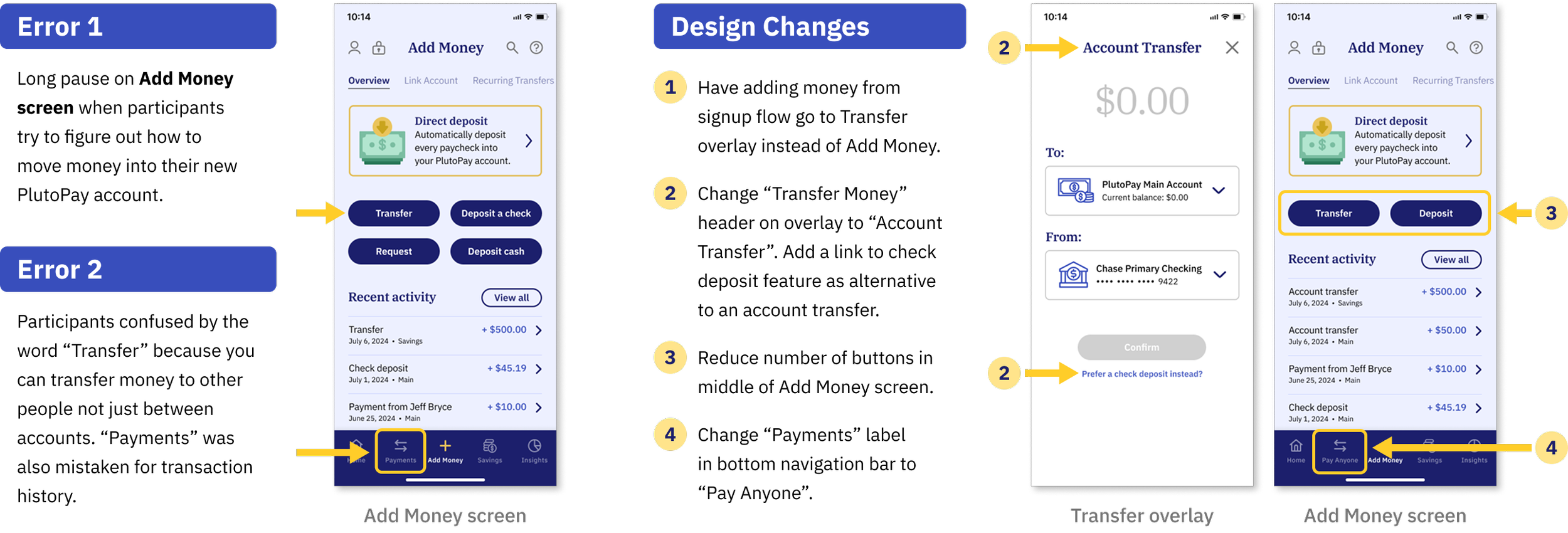
The Add Money screen was the point of highest friction.
Button and navigation labels resulted in some confusion.
Sample Errors and Resulting Changes
Finalizing the Design
With testing and reviews complete, I prepared my files for hand-off, put finishing touches on the interactive prototype, and created an interactive PDF style guide with direct links to exported design assets on cloud storage.
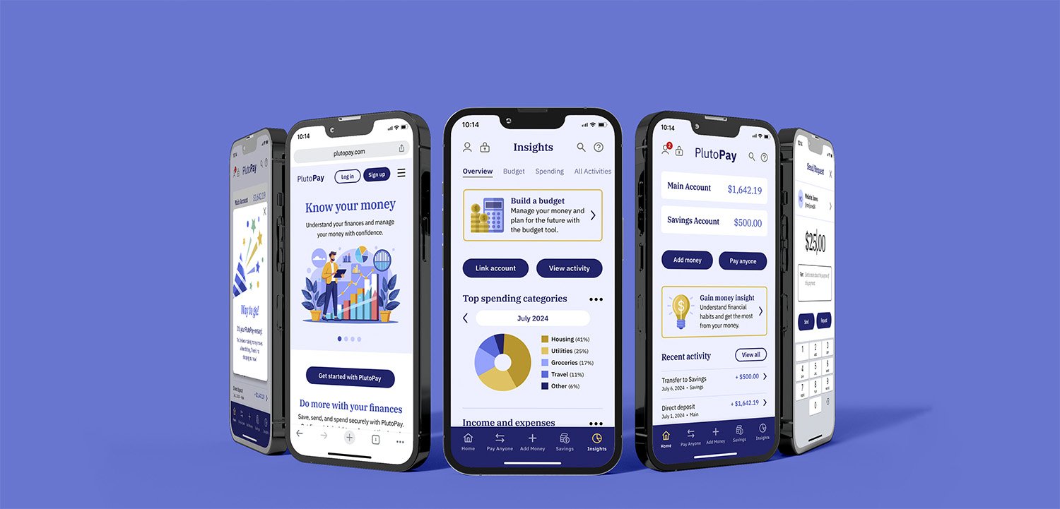
Mobile Screen Mockups
Try Out the Prototype
Project Summary
One of the biggest challenges of designing a new finance app for me was keeping the scope realistic and focused for the first version. After discovery and initial planning, I had to adjust my approach and cut some features to stay on track and on time.
In the future, I plan to seek out feedback earlier and use additional research methods like surveys. This may have made it easier to identify effective information architecture and navigation labels.
Areas for Improvement
The following aspects of the current design could use attention in the next iteration:
Finish designing top navigation sections Profile, Search, Help, and Notifications.
Put more emphasis on payment features since the app is called PlutoPay. On the marketing site homepage, the content currently prioritizes money management and savings.
Add animation to improve emotional engagement and boost personality.
What’s Next for PlutoPay?
During user interviews, participants felt that security and trust were very important for their finances. Competitive app product reviews revealed that some customers have lost access to funds with little explanation. They’ve also experienced a lack of communication regarding account issues. I plan to build out more security and privacy features in the next version.


